The Android version of our popular OBD2 software got a new version released few days ago. In this blog post I want to demonstrate one of the most important new feature of the released 1.1 version: Sensor Graph.
With the Sensor Graph you can see the OBD2 sensor values presented visually as a graph. The benefit of a graph is that it helps you to see trends in sensor value changes. It is also easier (for the co-driver) to monitor the values while driving. Moreover, the fullscreen sensor view uses black background color to save the battery life as much as possible. It’s good to use it if you wan’t to monitor some gauge for a long period of time.
The screenshots below illustrate the graphs. They demonstrate the different views in OBD Auto Doctor that let you monitor OBD2 sensor values. The screenshots are taken with the Nexus 7 tablet. The graphs really look good on large screen but they are usable smaller screens too.
If you haven’t tried the app yet, please do yourself a favor and try it now!
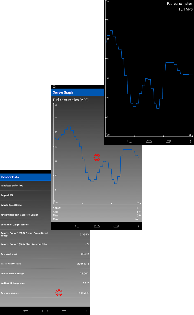
The red circles in the images demonstrate the places to be touched. Touching the Fuel consumption item in the list view opens up the Sensor Graph view. The Fullscreen Sensor Graph view is opened by touching anywhere in the graph within the Sensor Graph view.
Try it for free
Try OBD Auto Doctor for free. Download the software and start communicating with your car!